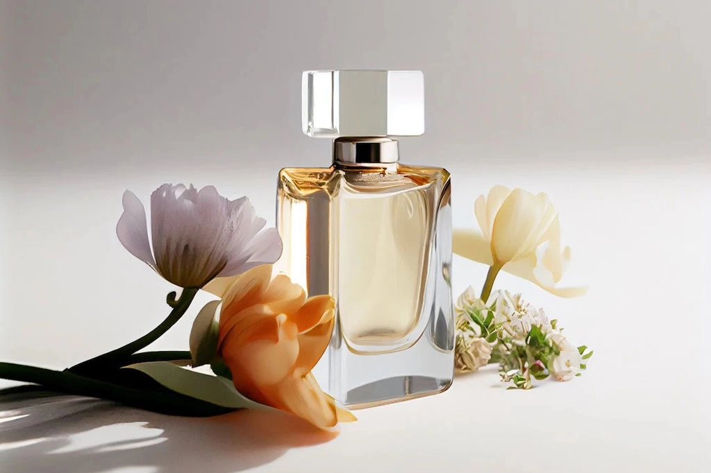
In the intricate world of fragrances, the battle for consumer attention extends far beyond the scent itself. An often-overlooked but pivotal aspect of a perfume’s allure is the color of its bottle.
This article explores the psychology behind the colors of custom perfume bottles, revealing how various hues influence consumer emotions and perceptions, and how brands strategically use color psychology to align the bottle design with the fragrance’s identity.
How Colors Affect Perception
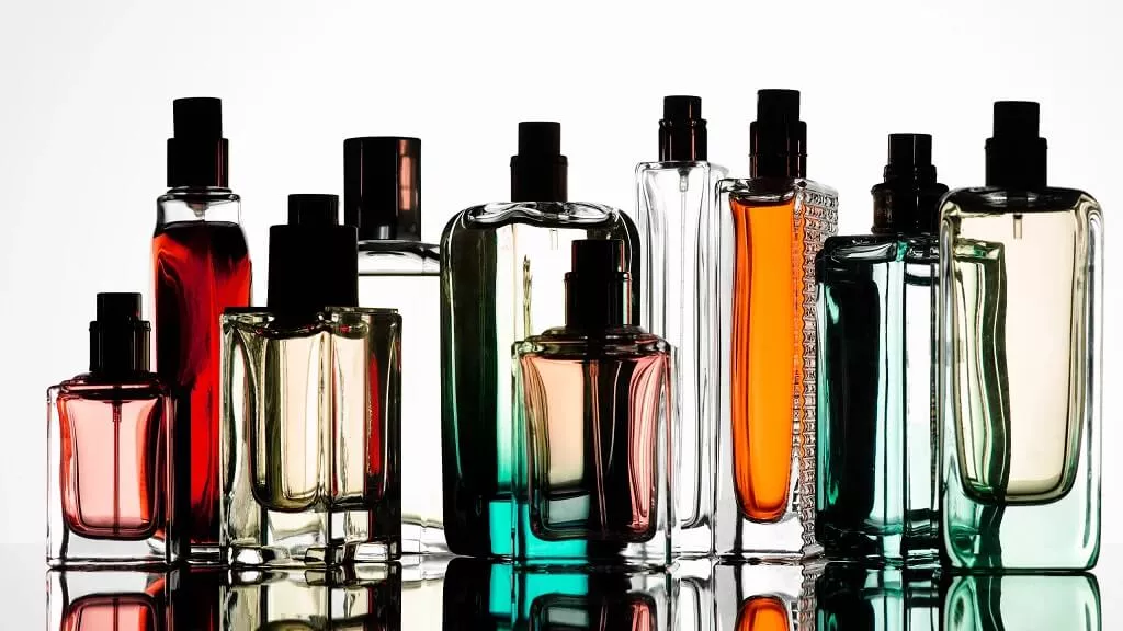
Colors communicate nonverbally, evoking specific emotions and associations within milliseconds. This immediate impact makes color an essential tool in sensory marketing, especially in the highly competitive perfume industry. Each color has its unique psychological effects:
Red, often associated with passion and intensity, can convey a sense of boldness and excitement. Perfume bottles in red hint at a fragrance that is powerful, seductive, or designed to make a strong statement.
Blue is the color of tranquility. Lighter shades suggest freshness and serenity, making them perfect for daytime or summer fragrances. Darker blues, on the other hand, evoke a sense of luxury and depth, suitable for more sophisticated scents.
Green bottles often house perfumes with herbal, fresh, or natural undertones, reflecting growth, harmony, and balance. This color resonates with consumers seeking organic or eco-friendly products.
Yellow and orange radiate warmth, happiness, and energy. Perfumes in these bottles are typically youthful, vibrant, and perfect for uplifting spirits.
Pink suggests femininity, romance, and playfulness. It’s commonly used for sweet, floral scents intended for a younger demographic or those young at heart.
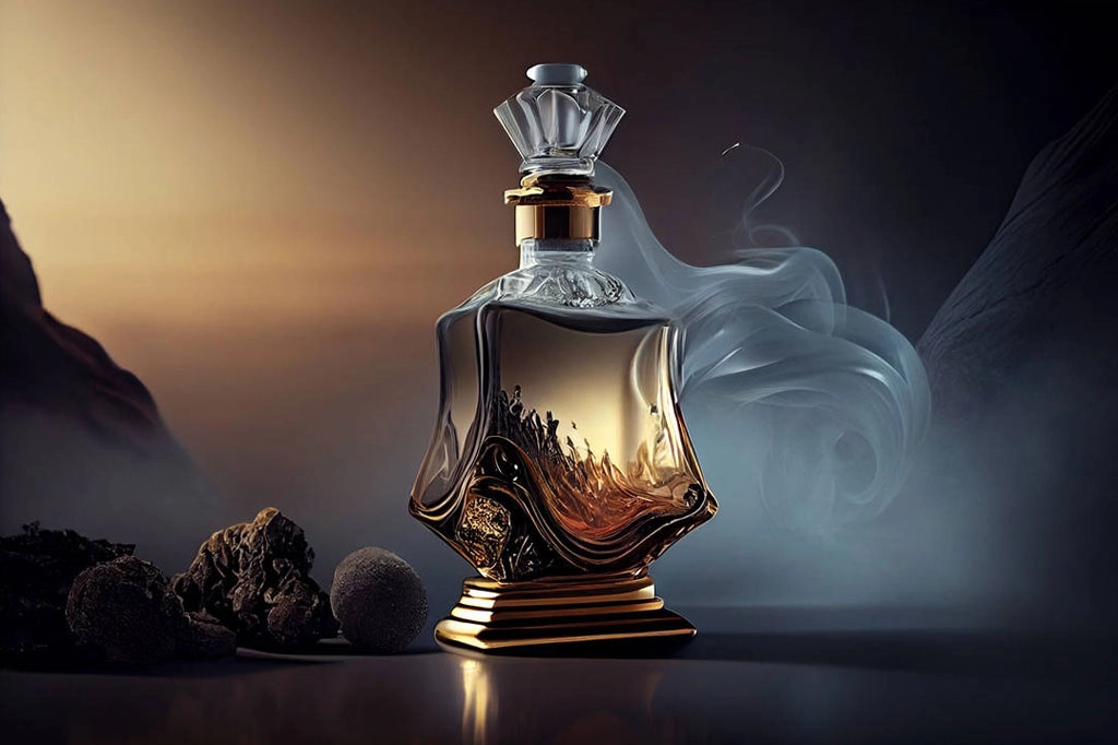
Purple bottles signify luxury, creativity, and mystery. Perfumes encased in purple are often exotic or have a deep, enchanting allure.
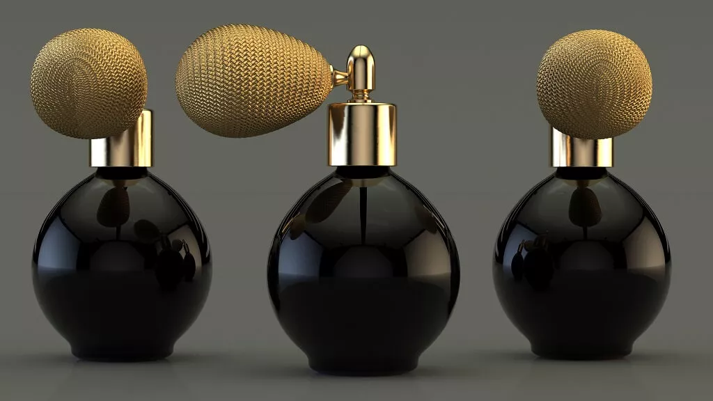
Black and white bottles denote elegance, simplicity, and sophistication. Black suggests a classic, powerful essence, ideal for evening wear. White is associated with purity and simplicity, perfect for clean, fresh scents.
Aligning Bottle Color with Fragrance Identity
The strategic alignment of bottle color with the fragrance’s identity is a crucial element in the perfume industry’s marketing strategies. This alignment ensures that the visual and olfactory elements of the product create a coherent story that appeals to the target audience’s desires and aspirations.
For instance, a perfume designed to evoke the freshness of the ocean might be housed in a blue bottle, instantly communicating its identity to consumers.
Moreover, color trends also play a significant role in bottle design. Fashion and design trends influence consumer preferences, prompting brands to adapt their packaging colors to fit current or emerging trends.
Conclusion
The psychology behind perfume bottle colors is a testament to the complexity of consumer psychology and the sophistication of marketing strategies in the perfume industry. By leveraging the emotional and associative power of colors, brands can create a multi-sensory experience that begins even before the fragrance is discovered.
This synesthetic appeal not only enhances the perceived value of the perfume but also establishes a deeper emotional connection with the consumer, ultimately influencing their purchasing decision.